Table of Contents
- Overview
- Understanding Aspect Ratios
- Choosing the Right Aspect Ratio
- Setting the Aspect Ratio in the Layout Editor
- Creating a Custom Ratio
- Best Practices for Working with Aspect Ratios
- F.A.Q.s
Overview
A well-designed layout should always look great on your screens without stretching, cropping, or leaving empty spaces. To achieve that, it’s essential to understand and configure the aspect ratio of your layout. Aspect ratio defines the shape of your layout and determines how content appears on your displays. The Layout Editor allows you to choose from predefined screen sizes or create custom ratios to perfectly match any display, from standard TVs to vertical kiosks or LED walls.
Understanding Aspect Ratios
The aspect ratio is the proportional relationship between a screen’s width and height. It’s written as two numbers separated by a colon; for example, 16:9 means 16 units wide for every 9 units tall.
Most digital signage displays follow one of a few standard aspect ratios:
| Aspect Ratio | Resolution Examples | Common Use |
|---|---|---|
| 16:9 | 1920×1080 (Full HD), 3840×2160 (4K) | Standard horizontal screens and TVs |
| 9:16 | 1080×1920 | Vertical signage, kiosks, digital posters |
| 1:1 | 1080×1080 | Square displays, social-media style signage |
| 32:9 | 3840×1080 | Ultra-wide LED walls, menu boards |
💡Pro Tip: You can calculate your screen’s aspect ratio by dividing its width by its height. For example, 1920 ÷ 1080 ≈ 1.78, which equals 16:9.
Choosing the Right Aspect Ratio
Choosing the correct aspect ratio ensures that your content fills the screen properly and appears exactly as intended. Here’s how to decide which one is best for you:
- Standard TVs and Displays: Use 16:9, which is the default for most modern screens.
- Vertical Digital Signage: Choose 9:16 for portrait-oriented content like directories or posters.
- Horizontal Digital Signage: Choose 21:9 for landscape-oriented content.
- Social-Style Displays or Branding Walls: 1:1 works well for square screens and grids.
- LED Walls or Multi-Screen Setups: Create a custom ratio to match unusual dimensions.
Real-World Example:
If you’re designing a menu board for a restaurant on an ultra-wide display, a standard 16:9 layout might leave empty space. Instead, setting a 32:9 custom ratio ensures your design fills the screen perfectly.
💡Pro tip: Enhance your viewing experience by adjusting your layout’s aspect ratio to match your display’s resolution. This simple change eliminates black bars and distortions, making your content look polished.
Setting the Aspect Ratio in the Layout Editor
The platform makes it easy to configure the aspect ratio directly when you create or edit a layout.
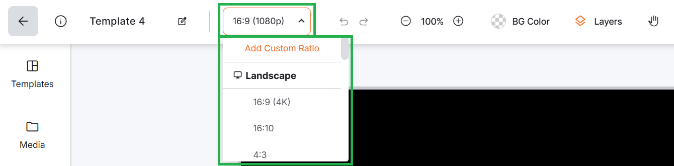
To set a predefined aspect ratio:
- Open the layout in the Layout Editor.
- In the Top Navigation Bar, locate the Resolution / Ratio setting.
- Choose from the list of predefined options (e.g., Landscape, Portrait, Full HD, 4K, Add Custom Ratio).
- The canvas frame will instantly resize to match the selected ratio.
Real-Time Update of Layout Preview
The layout preview updates in real-time, so you can immediately see how your content fits the new dimensions.
Creating a Custom Ratio
If none of the predefined ratios match your screen, you can create a custom ratio using your display’s exact pixel resolution.
To create a custom ratio directly from the Layout Editor:
- Open or create a layout.
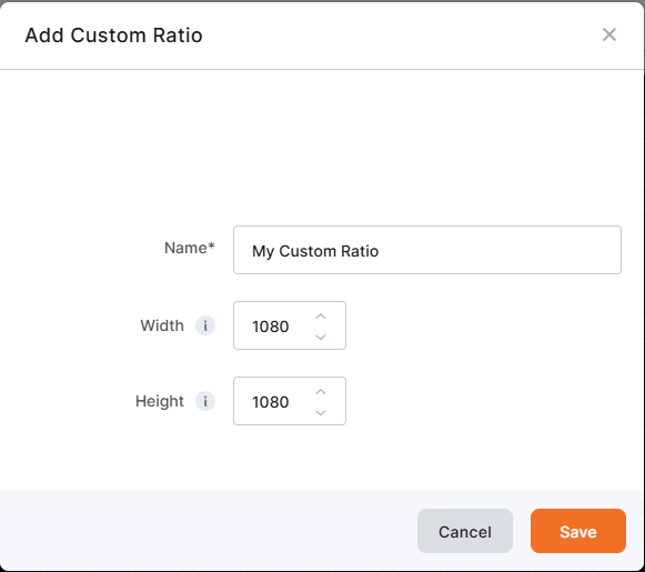
- In the Resolution / Ratio section, click Add Custom Ratio.
- Enter your display’s width* and height* in pixels.
- Click Save.
* The default maximum limit of the Width and Height is 4096 pixels.
Your new ratio will now appear in the list of available options and can be reused for future layouts.
To add custom ratios from Account Settings (optional):
- Go to Account Settings > Custom Ratios.
- Click Add Custom Ratio.
- Enter the width and height for each display type you use.
- Save them to make them available for all future layouts.
💡Pro Tip: Predefining custom ratios in your account saves time when you manage multiple screens with different resolutions.
Best Practices for Working with Aspect Ratios
- Always match your layout’s aspect ratio to your display’s resolution to avoid black bars or stretched content.
- Test layouts on a preview before publishing to confirm proper scaling.
- Create custom ratios for non-standard screens instead of forcing content into predefined ones.
- Design with flexibility: Leave some padding or use centered content if your layouts may run on screens with slightly different ratios.
F.A.Q.s
Got questions? We’ve got answers! This section addresses common questions about Working with Screen Sizes and Aspect Ratios.
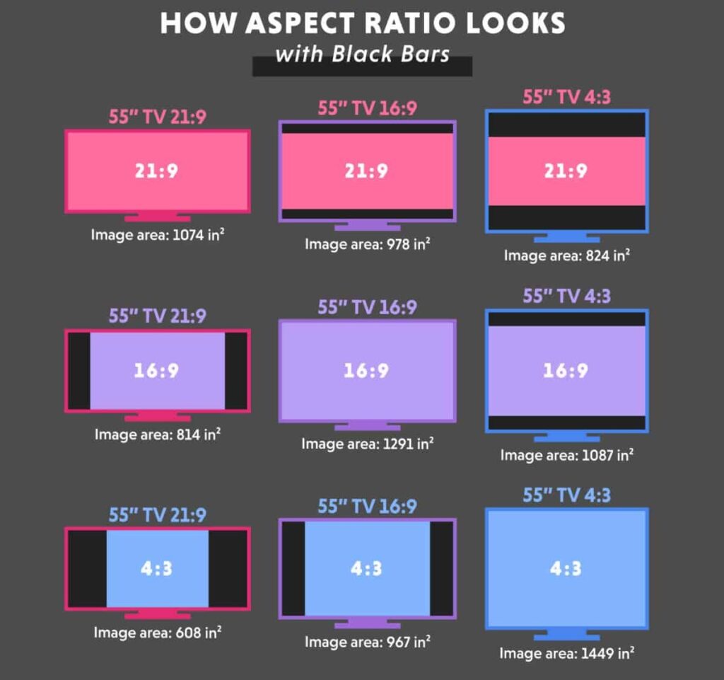
What happens if my layout ratio doesn’t match my screen?
The content will either show with black bars (letterboxing), stretch to fill the space, or crop out parts of the design. Always match your layout to the screen’s aspect ratio to avoid this.
Can I change the aspect ratio after creating a layout?
Yes. You can update it from the Resolution / Ratio dropdown at any time, but you may need to reposition or resize elements for the best results.
Do I need to use a custom ratio for vertical displays?
Not necessarily. The platform already includes a 9:16 preset for portrait screens. Use custom ratios only for unusual resolutions.
How many custom ratios can I save?
There’s no practical limit. You can create as many as needed for your displays.